
Norm
My latest 3DC scenery projects for Trainz
-
thegrindre
- Posts: 734
- Joined: Wed Jun 20, 2007 12:13 pm
- Location: Cotten fields of Mississippi, USA
I sure ain't gonna hold my breath waitin' for your e-mails.
Just checked, nothing as of 10:24pm Central Time.
Try sending 'em west next time, across that big patch of land, and leave all that water alone. Sheesh!
Rick
TRS 2004 Deluxe Edition v2.4 Build 2365
Creating in 3D Canvas Pro
Web site = http://allricksstuff.com/
TRS 2004 Deluxe Edition v2.4 Build 2365
Creating in 3D Canvas Pro
Web site = http://allricksstuff.com/
-
thegrindre
- Posts: 734
- Joined: Wed Jun 20, 2007 12:13 pm
- Location: Cotten fields of Mississippi, USA
Right now it's outta of it's banks and all over the place!
Well, I just about got this one all sewed up. Can't find a sheriff's sign anywhere and I hate makin' signs. They're a pain it the butt, but it looks as thought I'll have too.
Signage is one of my weaknesses. I'm not very good at it.
Wadda ya think?

I'm havin' an absolute ball doing this. Didn't know how much I missed 3D graphics.
Rick
TRS 2004 Deluxe Edition v2.4 Build 2365
Creating in 3D Canvas Pro
Web site = http://allricksstuff.com/
TRS 2004 Deluxe Edition v2.4 Build 2365
Creating in 3D Canvas Pro
Web site = http://allricksstuff.com/
Signs-R-Us
How 'bout me giving it a try. I've got this idea now since I'm doing a logo for us. Send me a size dimension and I'll send you an example. I'm at the office and might be able to knock it out by COB 2day.
Ken
Rick - Check your e-mail
Ken
Rick - Check your e-mail
"Floundering Around in Mediocrity For No Particular Reason...."
-
thegrindre
- Posts: 734
- Joined: Wed Jun 20, 2007 12:13 pm
- Location: Cotten fields of Mississippi, USA
Got your e-mail.
Fonts aren't the problem. I got zillions of 'em. It's a matter of applying body and depth into the letters giving them a 3D feel and look.
I'd like this sign to appear to have a wood engraving embedded into the sign board itself. Straight old western type lettering. Similar to my SALOON sign only straight.
Go for it if you think you can achieve all that. It should be 128x64.
I hate doing it. It takes too many hours away from other things I'd rather do.
Have fun!
Rick
TRS 2004 Deluxe Edition v2.4 Build 2365
Creating in 3D Canvas Pro
Web site = http://allricksstuff.com/
TRS 2004 Deluxe Edition v2.4 Build 2365
Creating in 3D Canvas Pro
Web site = http://allricksstuff.com/
-
thegrindre
- Posts: 734
- Joined: Wed Jun 20, 2007 12:13 pm
- Location: Cotten fields of Mississippi, USA
Here's my futile attempt at another sign. (I hate makin' signs.);

I guess it's a go unless somebody else comes up with a better sign...
I'll keep it a few more days to see what happens.
Oh, one other thing that bothers me. What color are we supposed to color the window pains? I did the Saloon's in black. What's the standard for Trainz?
Enjoy!
P.S. I still haven't received an e-mail from the kit-bash king.
Last edited by thegrindre on Tue Apr 08, 2008 4:21 pm, edited 1 time in total.
Rick
TRS 2004 Deluxe Edition v2.4 Build 2365
Creating in 3D Canvas Pro
Web site = http://allricksstuff.com/
TRS 2004 Deluxe Edition v2.4 Build 2365
Creating in 3D Canvas Pro
Web site = http://allricksstuff.com/
-
thegrindre
- Posts: 734
- Joined: Wed Jun 20, 2007 12:13 pm
- Location: Cotten fields of Mississippi, USA
Sure, when do you think I'll get it? LOLOLOL
Rick
TRS 2004 Deluxe Edition v2.4 Build 2365
Creating in 3D Canvas Pro
Web site = http://allricksstuff.com/
TRS 2004 Deluxe Edition v2.4 Build 2365
Creating in 3D Canvas Pro
Web site = http://allricksstuff.com/
-
thegrindre
- Posts: 734
- Joined: Wed Jun 20, 2007 12:13 pm
- Location: Cotten fields of Mississippi, USA
Hmmm, May 3rd, huh? LOL
OK, go to my beta page and have fun.
http://www.geocities.com/thegrindre/pag ... 4802432671
Remember, comments, suggestions, and criticisms are welcomed.
OK, go to my beta page and have fun.
http://www.geocities.com/thegrindre/pag ... 4802432671
Remember, comments, suggestions, and criticisms are welcomed.
Rick
TRS 2004 Deluxe Edition v2.4 Build 2365
Creating in 3D Canvas Pro
Web site = http://allricksstuff.com/
TRS 2004 Deluxe Edition v2.4 Build 2365
Creating in 3D Canvas Pro
Web site = http://allricksstuff.com/
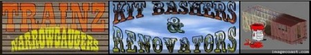
Kit-Bashers & Renovators, Inc.
Gentlemen
I have an announcement to make.....(can you hear the horns in the distant background)........Ta -DAAaaaaaaaaaaaa
For the past few hours (and some additional time I've devoted to many other things) I have come up with our own logo. Narrowgaugin' & Bashing Kits' are our speciality. Now we have running colors to prove it.
Tell me what you think about this :

I am W I D E O P E N for suggestions and critical events.
Just for your immediate edification, I had a 10 minute tutorial for MS Word Art and I went on to higher things. (and I haven't come down yet, so be careful). I know it is quite large at the moment, however, I will reduce the image to fit properly where it should go. There are three sizes I am considering :
1 - 640 x 180
2 - 360 x 110
3 - 500 x 140
The image resides at Imagecoast and if you are in agreement with this as it stands, I will indoctrinate the link upon your punkin' heads. Be kind to the Logo-Prez since he is still a Newbie. I may have to change locations to keep the Imageshack stamp from appearing. Any GOOD offers will be accepted (on the spot, if not sooner...)
Rick, if you still want a High Quality sign on your Hi-Poly office building, I'll do it for you. Embedded scrolled wood and all the refinements there-of.
(2morrow...)
Ken
I have an announcement to make.....(can you hear the horns in the distant background)........Ta -DAAaaaaaaaaaaaa
For the past few hours (and some additional time I've devoted to many other things) I have come up with our own logo. Narrowgaugin' & Bashing Kits' are our speciality. Now we have running colors to prove it.
Tell me what you think about this :
I am W I D E O P E N for suggestions and critical events.
Just for your immediate edification, I had a 10 minute tutorial for MS Word Art and I went on to higher things. (and I haven't come down yet, so be careful). I know it is quite large at the moment, however, I will reduce the image to fit properly where it should go. There are three sizes I am considering :
1 - 640 x 180
2 - 360 x 110
3 - 500 x 140
The image resides at Imagecoast and if you are in agreement with this as it stands, I will indoctrinate the link upon your punkin' heads. Be kind to the Logo-Prez since he is still a Newbie. I may have to change locations to keep the Imageshack stamp from appearing. Any GOOD offers will be accepted (on the spot, if not sooner...)
Rick, if you still want a High Quality sign on your Hi-Poly office building, I'll do it for you. Embedded scrolled wood and all the refinements there-of.
(2morrow...)
Ken
"Floundering Around in Mediocrity For No Particular Reason...."
-
thegrindre
- Posts: 734
- Joined: Wed Jun 20, 2007 12:13 pm
- Location: Cotten fields of Mississippi, USA
My Gawd! We have a sign maker, now. That's cooool! A little big, but still cool.
Let's see, we have a skinner/creator, a kit-basher, a signage man, who else is on the list?
Let's see, we have a skinner/creator, a kit-basher, a signage man, who else is on the list?
Rick
TRS 2004 Deluxe Edition v2.4 Build 2365
Creating in 3D Canvas Pro
Web site = http://allricksstuff.com/
TRS 2004 Deluxe Edition v2.4 Build 2365
Creating in 3D Canvas Pro
Web site = http://allricksstuff.com/